by Andy Crestodina
Your website visitors take action, or they don’t. Some become leads, subscribers, registrants and customers. But most of them do not. Your conversion rate is the percentage of your visitors who take action on your website.
This number is so important that it was the topic of the first article I ever wrote, way back in 2007. It’s here, but don’t read it. This will be a much more useful article.
So why do visitors convert? What are the factors? How can you increase the conversion rate on your website?
In the next few minutes, you’ll see why visitors take action and how you can improve the conversion rate on your website.
Context + Empathy = Conversion
Every visitor to every page came to your site for a reason. Understanding this is the key. Each of them has questions and desires, hopes and fears. Your ability to convert them starts with your ability to understand them and to speak to their specific needs.
Each of your visitors is doing a cost-benefit calculation. Do the rewards outweigh the effort?
What’s in it for me?
If the perceived value is greater than the effort required to get that value, they convert. The motivation is stronger than the friction, and they move forward, reaching the goal.

There are two ways to increase your conversion rate: increase their motivation and make it easier for them to take action.
The key in both cases is to understand the visitor. If we know what they’re thinking, we can assure them that we are the best solution, increase their confidence and reduce their uncertainty.
To guide our decisions as we improve our websites, we’ll draw a map. This conversion map will describe how we connect with the mindset of our visitors, guiding them toward actions, moving them from suspect to prospect.
Audience questions → Answers → Evidence → Action
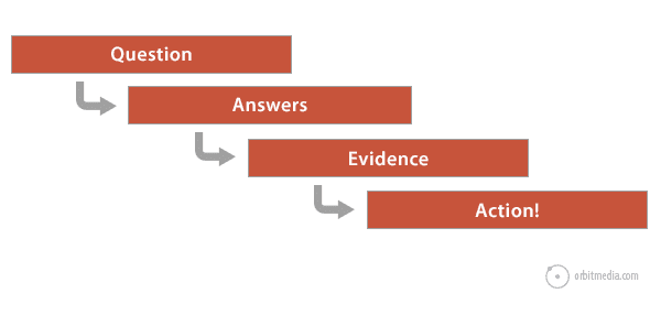
It starts with the questions and concerns of our audience. Our map begins in the hearts and minds of the visitors. We start there and head down the following path:
- Answer questions and address concerns
- Support our claims with evidence
- Provide an easy way to take action
Simple, right? Not really. Most websites fail at this completely. They leave questions unanswered, claims unsupported and provide no specific calls to action.
But every marketing website succeeds or fails based on these criteria.
This map to conversions is relevant to any visitor, looking for anything at all, from a quick decision about plumbing to a long, multi-stakeholder decision about technology.
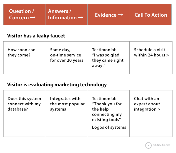
Answering questions
If you know your audience, adding the answers isn’t tricky. Ask the sales team this simple question:
- What three questions do people always ask before buying or hiring us?
Now just put those top questions and answers on the pages for that product or service. It’s that simple. Here are other answers to add:
- What makes us different than our competitors? (homepage)
- Why did we start this company? What do we really stand for? (about page)
- Who works at this company? (team pages)
The main purpose of your website is to answer questions!
Your website should emulate a conversation between a sales rep and a prospect. The visitor needs specific questions answered in a specific order. A good website increases conversion rates by doing this in a smooth, frictionless way.
Warning! Do not put answers to important questions on an FAQ page. Put them on the relevant product or service page. Our map should have a short path for our visitors. Don’t make them hunt for answers.
Adding Evidence
There are two kinds of evidence that support your marketing claims.
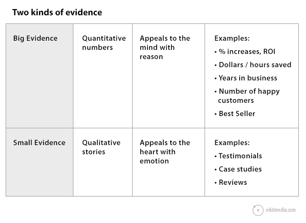
To improve your conversion rate, use both. Some visitors need data to make decisions. Others are affected more by the stories, first-hand accounts and social proof.
Look at the marketing pages on this website and you’ll see. We provide hard numbers that show our results. And we provide testimonials from our clients, right there with faces, names and company logos.
Amazon is a great example of conversion optimization at work. Yes, they have book reviews. But they also have a bar chart with data about the ratings. Here’s an example from the Amazon page for our book, Content Chemistry.
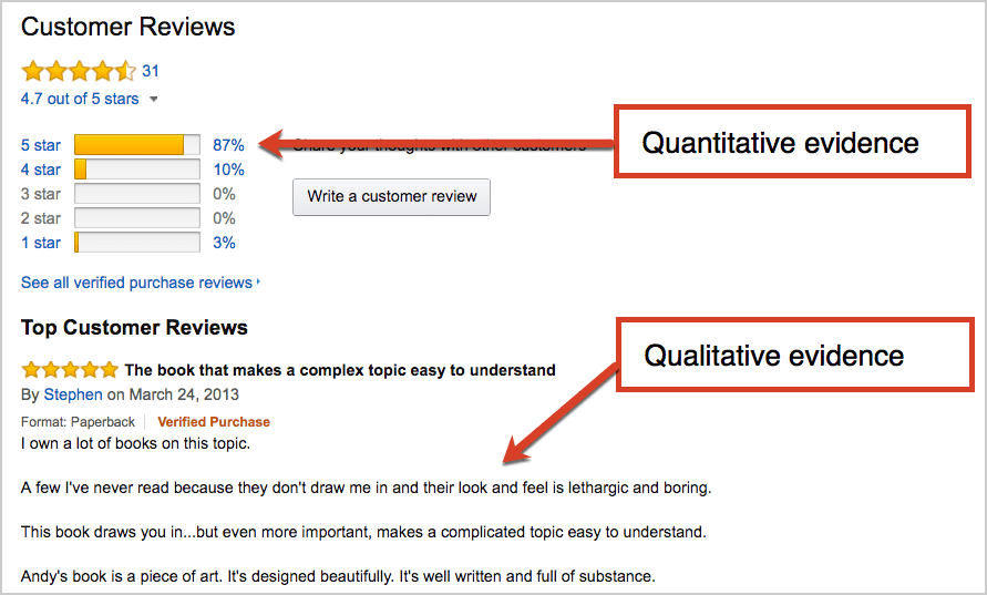
Warning! Do not put testimonials on a testimonials page. Put them on the relevant product or service page. Visitors will likely miss evidence if it isn’t in context. We recommend you remove your testimonials page from your website.
Messages, messengers and format
In marketing, we all claim to be good. We are good. We are better. We’re the best. That’s our message and we are the messenger.
But our conversion map shows us how to improve on this approach. The message must be specific to the concerns of the visitor. And the messenger should be a third-party, such as a customer. Answers and evidence.
But there’s another key ingredient: the format.
Words aren’t the only way to deliver a message. In fact, words are the weakest way. Visuals are a more powerful, compelling way to deliver a message. Just as third-parties and customers are stronger messengers, images and videos are stronger formats.
Imagine an audience that needs to know how soon things will be delivered before they convert. In this case, “fast service” is an important message. That message can be delivered in different ways, some strong, some weak.
Here are examples of how messengers and formats combine for the “fast service” message.
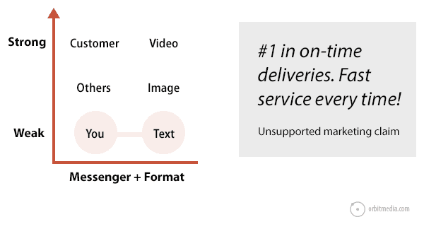
The brand makes a claim about themselves in text. It’s common, expected and weak. Don’t expect this approach to improve your conversion rates.
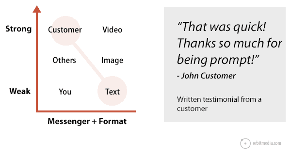
The voice of customer adds evidence. Now the claim is supported in a qualitative way using social proof. But text has limited ability to maximize conversions.
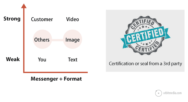
The certification or award comes from a third party. It’s not a customer, but it’s still coming from a source other than the brand. And the visual adds interest and credibility.
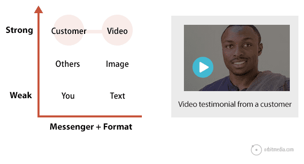
The fully upgraded video testimonial is the strongest message in the most effective format. There is no more powerful form of evidence, with the possible exception of an in-person referral from a trusted friend.
How can I increase my website conversion rate?
By now you should have a few ideas. Look at the marketing pages on your website. Run them through this quick 5-point checklist:
- Does this page clearly state the benefits of my product or service?
- Does this page answer the top questions of the visitor?
- Does this page include evidence to support our claims? (testimonial, endorsement, statistic, case study)
- Does this page have a clear call to action?
- Does this page use formats beyond text?
If anything is missing, it can probably be added with content. No design or programming required. In many cases, it can be fixed with a bit of writing and editing. Ten minutes of work may lead to a better conversion rate and years of better results.
We are all visitors. We all convert.
The mechanics of conversion are not a mystery. And the visitors to our website aren’t aliens from other worlds. It’s us. We’re all visitors and we all become leads and customers every day.
To map a conversion, trace the steps of your last online purchase. Find that most recent email receipt and go back and look at the website. Check your browsing history. Think back on what questions you had, how they were answered and what evidence was provided to build your trust.
Now go look at your website. Anything missing from your conversion map?
Andy Crestodina is Strategic Director, Orbit Media. Opinions are his own. You can reach him at andy@orbitmedia.com. Find more tips from Andy here.